SHOPIFY POLARIS – EVERYTHING THAT YOU NEED TO KNOW
Shopify has introduced Polaris Shopify. A new design system that helps Shopify Designers and partners to create a consistent user experience for merchants. The system helps use best practices from Shopify’s own design team when developing new interfaces and apps.
WHAT IS SHOPIFY POLARIS?
The Shopify Polaris design system is a set of comprehensive guidelines and principles that designers can use while building apps and channels for Shopify. It offers a range of resources and building elements like patterns, and is available to all Shopify partners. Instead of focusing on creating already-existing elements and mimicking design patterns, Shopify Designers can now focus on what really matters: providing solutions that blend in with Shopify seamlessly. This gives better user experience and keeps everything uniform and consistent.
WHAT IS DROPSHIPPING? HOW TO START IT IN 2020? [EXTENSIVE GUIDE]
The Polaris Shopify system holds all the building blocks needed to create apps that will feel familiar to merchants, and won’t require a learning curve. Plus, it allows partners to download a style guide, a library of components and patterns, and a UI kit they can use.
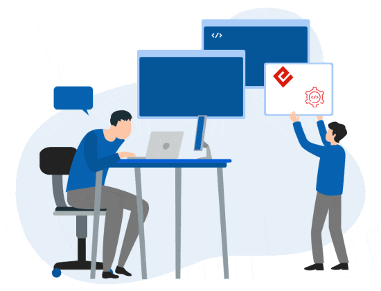
Shopify developers have recently been using it to do some rapid prototyping for app development. And it’s saved us a ton of time to work within a fixed design framework. Even though we were skeptical at first about the benefits.
WHAT IS SHOPIFY POLARIS USED FOR?
Polaris Shopify is used to build all the elements that make up a great user experience. From the app and channel content to design and layout patterns. The Polaris design system includes the following:
HOW TO LOOK UP FOR NEW BUSINESS OPPORTUNITIES?
GUIDES
Guidelines and best practices on creating elements for Shopify admin and apps, incorporating accessibility and internationalization options. The aim is to provide merchants with a fluid experience when switching between core Shopify and app functions. Because for usability they should look and feel the same.
CONTENT
Guidelines and resources on using content to improve user experience. From writing product descriptions and using the right tone and voice, all the way to naming products and adding alternative text, this section covers best practices on utilizing language as a powerful UX element. Here, designers can learn all about preferred date formats, the proper vocabulary for actions, and developing a strategic plan for language.
HOW TO DEVELOP AND LAUNCH A NEW PRODUCT IN THE MARKET?
DESIGN
Resources and guidelines on using colors, typography and illustrations, as well as best practices on sounds and icons. This section also covers the use of spacing, data visualization, and interaction states.
COMPONENTS
Includes a collection of readily available interface elements, including React and CSS components that Shopify Designers can use to provide a consistent experience across channels and apps.
PATTERNS
Best practices for arranging the page layout: from screen structure to page components, standard layouts and navigation. This section also covers best practices for error messages including; types of messages, what colors to use, and the best way to display various error message types.
HOW TO CREATE DIGITAL PRODUCTS TO SELL BY GENERATING REAL PASSIVE INCOME?
HOW TO USE POLARIS TO BUILD AN APP UI IN HTML OR REACT
To make Polaris Shopify as user friendly as possible, it includes markups for both HTML and CSS interfaces, as well as those built in React. Polaris also provides design guidelines that are written and used by Shopify’s own lead designers. Even the guidelines are well worth the reading time, and instruct how to build great user interfaces. Make sure you design before you build. Before you get coding, it’s common to first design how you’d like your user interface to look. In the Resources section of Polaris Shopify, you can download the UI kit as a Sketch file. This will provide you with all the components, as well as a color palette, texts, and styles.
USE THE COMPONENTS TO START CODING
As mentioned above, Polaris components are available to you as both CSS files that can be used in static HTML (or HTML generated by any other framework you prefer), or as React components. We’ll start off by showing how to create a stand-alone page in CSS.
BUILDING WITH CSS COMPONENTS
Using the text editor of your choice, create an ‘index.html’ file and input boilerplate responsive HTML, including a line to make the viewport expansive and a title for the app. To create a stylesheet, you’ll need to grab the link tag in the Installing and implementing section in the Components collection, and paste into the head of your HTML document.
HOW DO I START MY OWN CLOTHING LINE: STEPS TO CONSIDER
HOW TO USE POLARIS TO BUILD AN APP UI
- Simply create a stylesheet
- Copy the highlighted link tag, and past into the text editor.
- With this boilerplate in place, you’ll only have an empty page, so you’ll need to add structure. In the component menu under Structure, select Page. In this section, you’ll be able to use one of the most practical features of Polaris that is the interactive playgrounds.
LET’S GET STARTED WITH SHOPIFY POLARIS
Shopify Experts who want to design with Shopify Polaris will need to download the Sketch UI kit and React components first. These can be accessed from the main Polaris landing page. And for more updates and similar news, you can simply view blogs at Shopifyninja.


0 Comments